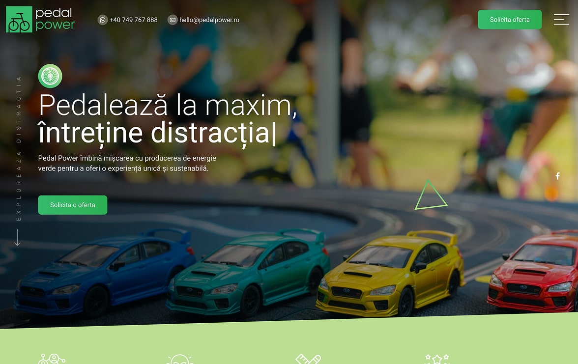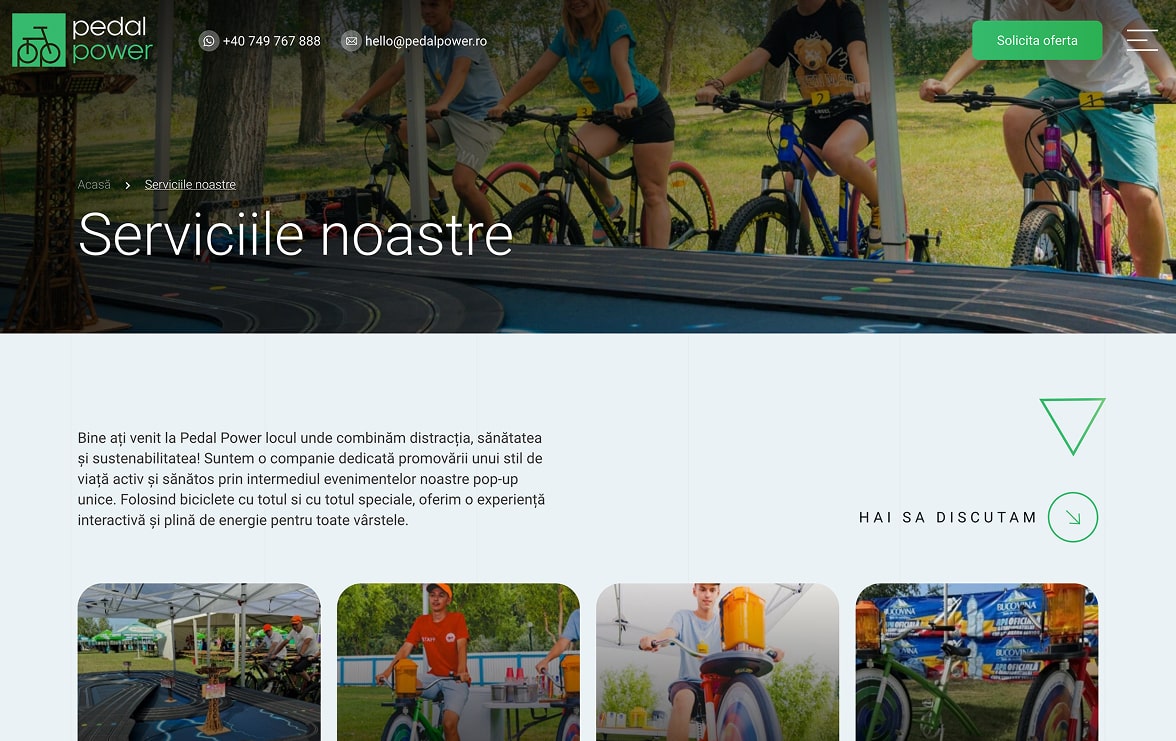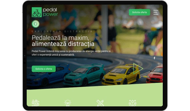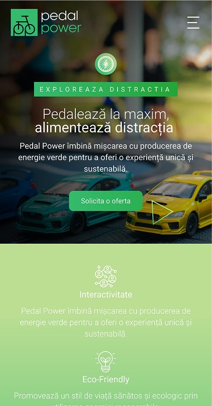
Pedal Power is a company dedicated to creating interactive experiences that combine physical movement, fun and the production of green energy. Through generator bikes and pop-up activities, Pedal Power promotes a healthy and sustainable lifestyle, transforming pedaling into a real source of entertainment and engagement.
Our collaboration with Pedal Power began with the goal of creating a digital platform that would clearly communicate the brand’s innovative concept: fun through movement and renewable energy. Together, we analyzed the types of events, the target audience, and how the sustainability message should be naturally integrated into an engaging visual experience. We defined the site’s structure, navigation flows, and visual tone, emphasizing interactivity, clarity, and conversion. Constant communication and rapid feedback allowed us to refine each stage and achieve a coherent result, aligned with Pedal Power’s values: energy, health, and fun.
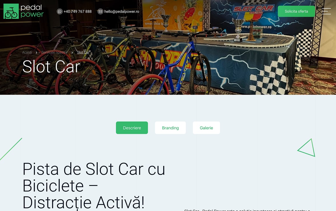
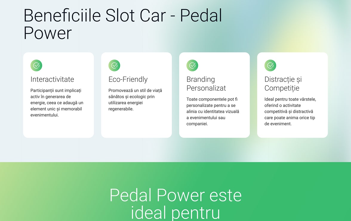
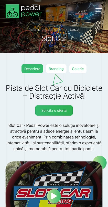
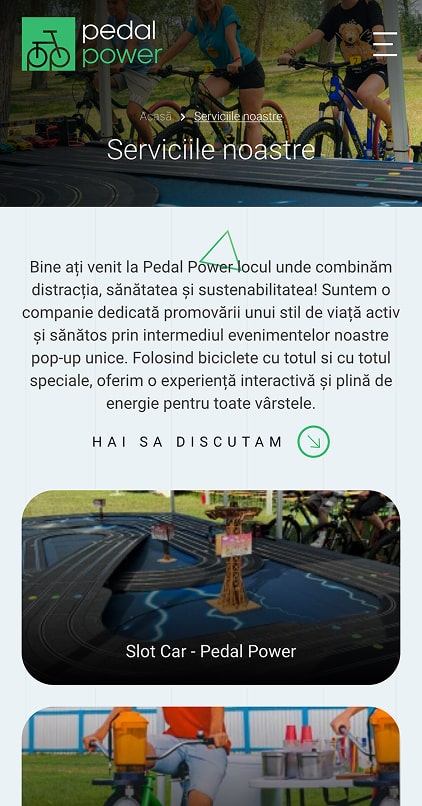
The platform highlights the interactive and eco-friendly nature of Pedal Power services through intuitive sections (Services, Events, Gallery, FAQ, Contact) and visual presentation of activities (Smoothie Bike, Juicer Bike, Slot Car, High Striker). Key benefits—green energy, interactivity, competition and personalized branding—are clearly highlighted, and CTAs (Request a quote, Phone, Email) facilitate rapid lead generation. The website is optimized for mobile, performance and SEO, offering a fluid and easy-to-understand experience from the first access.
The result: a modern, energetic and conversion-oriented site that reflects the Pedal Power spirit and positions the brand as a provider of sustainable and memorable experiences.


The Pedal Power logo stands out with a smart and minimalist design, where the bicycle wheels are creatively formed from the letters “p” of the name. The use of the color green suggests energy, health and a sustainable lifestyle, while the modern font offers clarity and accessibility. It is a dynamic visual identity, perfect for a brand focused on movement and ecology.
 +(40) 745 270 642